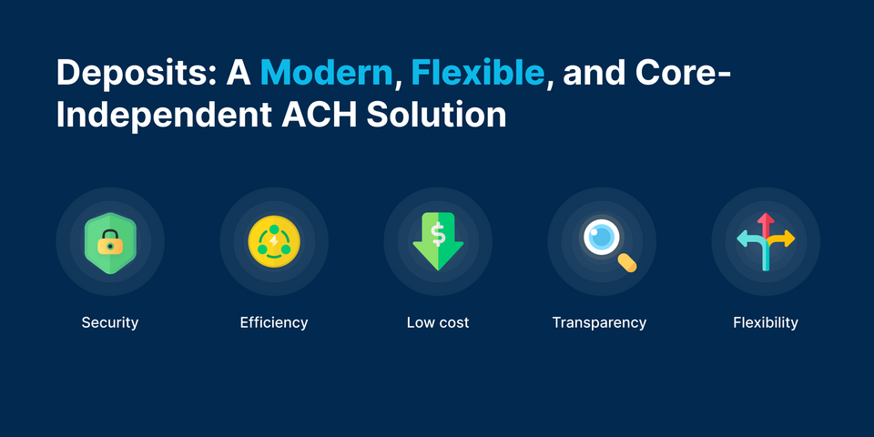
The Fintech UI kit was built to fulfill the need for users to have a pleasant and modern financial experience. It is critical that users have a positive experience on your application/platform, regardless of the financial service you provide. It supports you in creating a modern money experience for your users.
This offers the components needed to build a variety of consumer-facing financial services, such as cryptocurrency wallets, digital banking, and mobile apps.
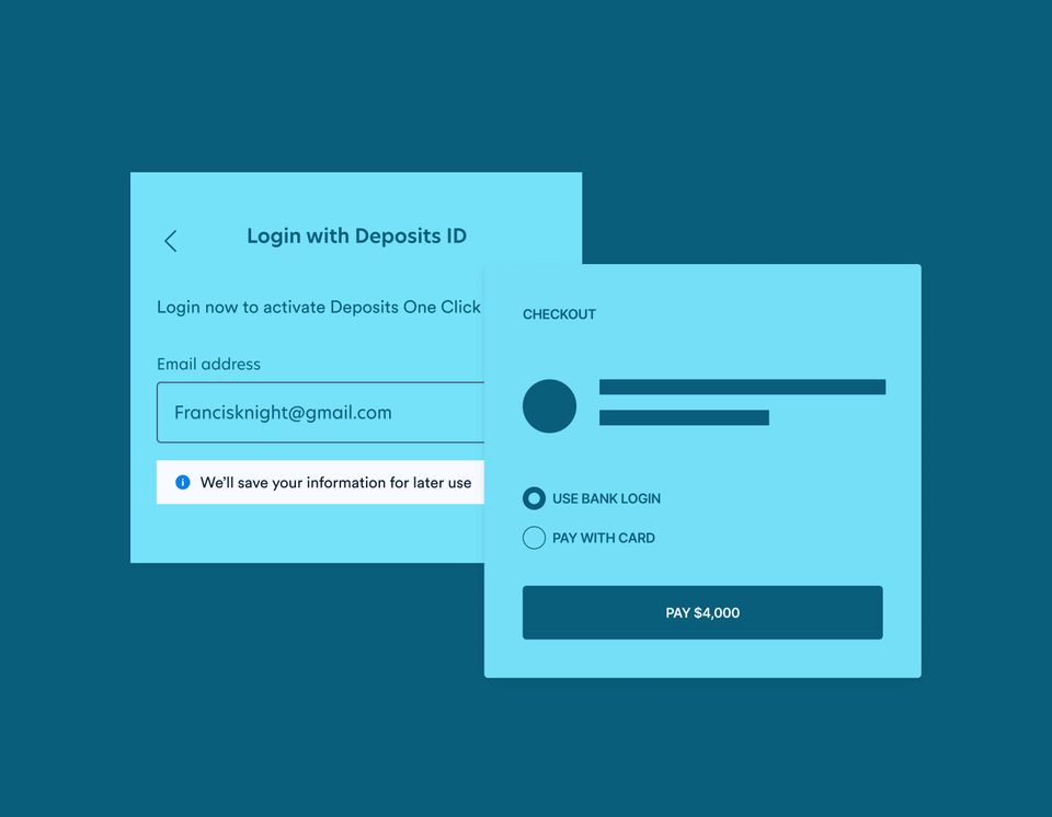
As a merchant, you want to make it simple for your customers to checkout in a few quick steps or a single click, reducing cart abandonment while increasing the sales conversion rate. The Deposits One-Click Checkout SDK solves this problem for you and even allows for customization.
Online retail, creator commerce, marketplace, and even BNPL applications can be built with one-click-payment embedded. The one-click SDK simplifies this for you.
This package offers development for Android, iOS, and web utilizing the Javascript SDK. As a result, it is a viable payment method.
The SDK includes features such as:
- Simplified Security: Deposits One-click checkout makes it simple to capture sensitive data while remaining PCI compliant. This is feasible since the acquired data is delivered directly to Deposits rather than through your servers. For additional details, please see our Integration Guide.
- Native UI: We provide user interfaces and components for securely collecting payment information on Android and iOS.
- Payment Method: Accepting card and ACH payments allows your brand to access a wider audience and increase checkout conversion.
- Fast Checkout: Payment details can be tokenized, and subsequent payments can be processed with a single click, simplifying transactions.
- Customization: The Deposits Fintech UI kit allows for customization to the Deposits One-click Checkout. This allows you to build your payment modal page using your brand colors, no matter what they are.
Getting started with One-Click Checkout
The only requirement for this SDK is your public key from the Deposits console. To utilize this SDK, embed the base URL that is best suitable for the environment you're working in, then initiate the checkout. More information can be found in the reference.
Embedding The Base URL
You can embed the base URL in your application by calling any of the following scripts, depending on your working environment.
// staging environment
<script src="<https://api.deposits.dev/sdk/checkout.js>"></script>

// production environment
<script src="<https://api.ondeposits.com/sdk/checkout.js>"></script>
Initiating The Deposits Checkout
This is the section where you can start the checkout process and customize it as needed. Because of the script we imported before, this function is now available in your code.
The function takes a single argument, an object that contains all of the information required by the SDK to successfully commence checkout.
            DepositsCheckout({ amount: amount,
			public_key: publicKey,
			email: email redirect_url: "https://example.com",
			light_theme_color: "#27370D",
			dark_theme_color: "#27370D",
			no_page_header: false,
			no_scroll_bar: false,
			dark_mode: false,
			light_mode_background_color: "#ffffff",
			dark_mode_background_color: "#121abe",
			reference: Math.random() * 999999,
			business_public_key: "DPTPUB-577F4B1C905DF5D1",
			callback: (data) => { console.log("callback", data); },
		    });
There are numerous parameters that must be provided before the checkout can begin. However, the following are critical in achieving customization.
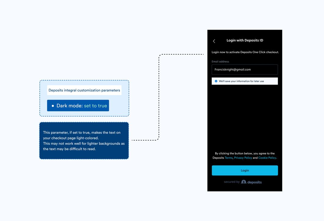
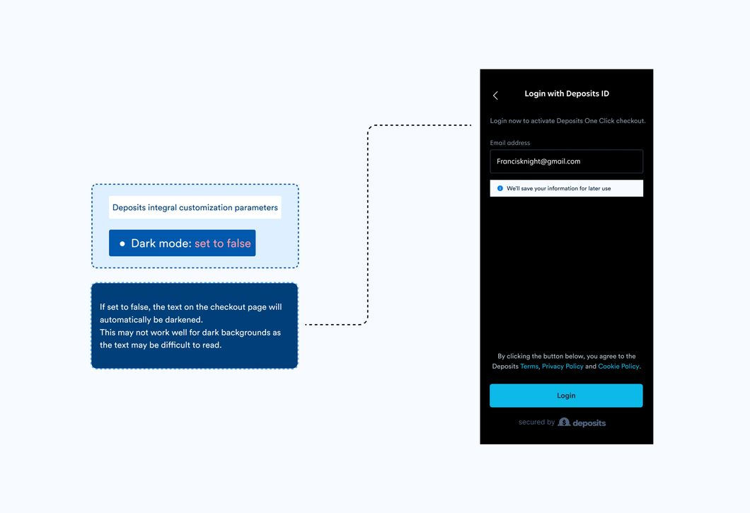
Dark Mode:
This parameter, if set to true, makes the text on your checkout page light-colored. If false, the text on the page will automatically be darkened. Setting this parameter to true may not work well on pages with a light background color as the text may be difficult to read.
Theme Color:
The color of the buttons on the checkout page is determined by the theme. This color might be your brand's color or any other color of your choosing. The theme color in the image below is lemon, with the HEX code #27E70D, thus the button is also lemon.
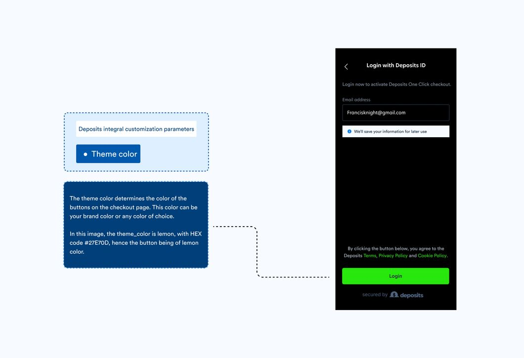
The 'theme color' property determines the primary color of your checkout page; it influences buttons, input borders, and the primary color of other components. This color could be the color of your brand or any other color of your choice. The theme_color in the image below is lemon, with the HEX value #27E70D, and so is the button.
Theme color can also be specified as light_theme_color, or dark_theme_color. You can use this to set a separate theme color for light and dark modes (like in the one click checkout demo).
Background Color
The color of the background is determined by this. You can choose any color for this, just like you can for theme color, by providing the hex code for the color of your choosing. The background color in the image below is blue, with the hex value #112AEE.
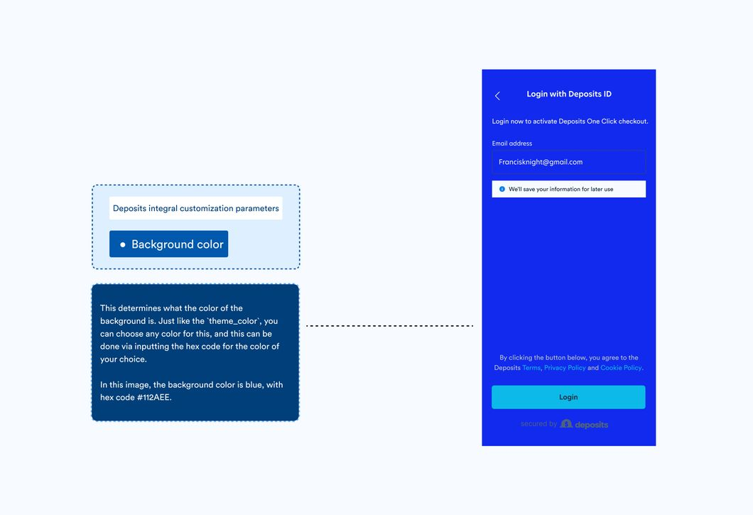
When selecting a background color, it is critical to consider the contrast of the text color. Similar to theme_color, there’s also light_background_color and dark_background_color to set different colors for light and dark mode.
The theme and background colors on the checkout page can be adjusted to light or dark mode, as shown below.
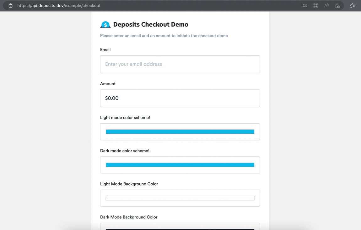
To see how the SDK works, you can view, play around with and initiate an example checkout process here.
Our Fintech UI Kit, powered by our theming engine, allows for maximum customization by allowing you to combine numerous components to develop a solution to a problem.
You can use our UI Kit to design low-code solutions to problems that your brand challenges.