Creating reusable components from scratch can significantly impact the time spent on application development.
To expedite financial services product development, various tools have emerged to optimize for time-to-value, offering a wide array of pre-built components. However, these tools often face limitations in addressing specific customization and compliance requirements.
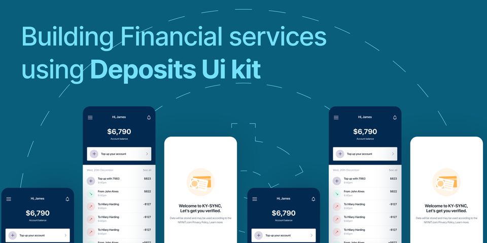
Deposits UI Kit is a collection of pre-built components and assets that minimize the time teams spend on designing and building financial services. It provides all the building blocks needed to build reusable and scalable fintech applications with VueJS and ReactJS.
The Deposits UI Kit is outstanding as it offers a set of fundamental design elements that are not only applicable to the fintech field but can also be applied in other sectors. These elements include font, colors, icons, space, and layout principles etc. The integration of the UI-Kit means that all components generated with it have the same design language, providing the application a uniform look and feel while being built in record time.
Getting started
To get started with the UI-Kit, you need basic understanding of:
- HTML, CSS, and JavaScript (Vue, React),
- Stateful & stateless components.
The UI-Kit is built for the JavaScript frameworks; ReactJs and VueJs. They are composed of small pieces of code known as components. Consider each component to be a Lego piece that comes together to make an application, with each red, blue, or yellow Lego block being reusable when needed.
Components can either be stateful or stateless. Stateful components are those that have an internal state. Whereas, stateless components are smaller pieces of component that have no states. They provide props rather than states.
Installation
You should already have a Vue3 application setup before installing the Deposits UI Kit. If not, you can Create a simple vue application.
Before anything, you’re required to install the DEPOSITS UI Kit using the code snippet below.
$ npm install @deposits/ui-kit-vue
In order for the components to be styled properly, the compiled CSS has to be imported to the main.js file (or similar entry point) in your Vue application.
<your-application>/src/main.js

import { createApp } from "vue";
import App from "./App.vue";
++ import "@deposits/ui-kit-vue/dist/style.css"; // This line of code makes the css (styling) of the components available to your app

const app = createApp(App);
app.mount("#app");
Basic Usage
The @deposits/ui-kit-vue package contains Vue components that can be imported into your project. In the case of Vue, the multi-word name convention is used for , all UI components are prefixed with a "D.” Example: DButton, DText etc.
<template>
	<d-text>Hello World</d-text>
</template>

<script setup>
	import {DText} from '@deposits/ui-kit-vue’
</script>
The Deposit UI Kit supports inline styling as well as CSS classes, however as a fan of inline styling I don't particularly make use of class styling except it is being reusable.
A basic example of how this can be used to build a simple login page.
Starting off after setting up your template, you would have to import the components into the file you're working on all within your <script> tag. Once that is done you then import the component between the <template> tag. As seen in the block of code below the styling of the d-text can be done in-line as well as the use of classes.
<template>
	<d-box width="100%" height="100vh" background="#fafafa" display="flex" justify-content="center" align-items="center">
		<d-box display="flex" flex-direction="column" align-items="center" max-width="500px" >
			<d-box is="img" alt="" src="<https://assets.deposits.com/img/logo/deposits/svg/logo_main.svg>" height="30px" margin-bottom="1em" />
			<d-card>
				<d-text font-size="18px" font-weight="600" color="#212934" center> Login to dashboard </d-text>
				<d-text center scale="subhead" margin-top="1em"> Welcome back, provide your login details below to access your dashboard. </d-text>
				<d-box margin-top="1em">
					<d-textfield size="xlarge" label="Email Address" placeholder="example@gmail.com" width="100%"/>
				</d-box>
				<d-box margin-top="1em">
					<d-textfield size="xlarge" label="Password" is-password placeholder="Enter password" width="100%"/>
				</d-box>
				<d-button margin-top="1em" color-scheme="primary" size="xlarge" responsive> Login </d-button>
				<d-text :is="RouterLink" to="/reset-password" class="text-cyan-500" center display="block" margin-top="1em"> Reset Password </d-text>
			</d-card>
			</d-box>
		</d-box>
</template>

<script setup>
	import {DBox, DCard, DText, DTextfield, DButton} from "@deposits/ui-kit-vue";
	import {RouterLink} from "vue-router";
</script>
Advantages of using Deposits UI Kit
Deposits’ UI-Kit offers a huge amount of high-quality Vue & React components that are incredibly customizable. This makes the UI-Kit truly a joy to work with from a developer's perspective.
It was designed with a couple of core principles in mind:
Style Props: All component styles can easily be overridden and extended to reduce the use of CSS.
Simplicity: Each component has a simple API and the documentation shows key real-world scenarios of using the component. Its simplicity and modularity is one of the key features of the UI-Kit.
For example, let's take a look at the DBox component, which wraps around a div element. It’s the most reusable element in the Deposits Ui kit toolset and can be used to compose basically anything.
<d-box is=”button” display=”flex” >
	Click me!
</d-box>
Layout: The Deposits UI Kit has a pre-fixed layout structure that works well with each and every component within its ecosystem. So far it is made up of Auto Layout, Grid Layout and Responsive Layout.
The layout system includes a set of components to assist developers in implementing responsiveness. It provides a responsive 12-column grid layout as well as wrappers for CSS Flexbox and Gridbox.
Accessibility: The science of making a digital product accessible to older users, the visually challenged, the colorblind, and others is known as accessibility (including people on low contrast, low-quality displays). The Deposits Ui Kit follows the four principles of the Web Content Accessibility Guidelines (WCAG) making use of color usage, hierarchy and structure, Imagery and media and copywriting.
Theming: The Deposits Ui Kit theming engine allows developers to customize the appearance and functionality of their web applications with ease. It offers a wide range of options for theme customization, such as color schemes, fonts, and other visual styles. Developers can select from a variety of color schemes or develop their own custom palettes limited by their imagination.
Conclusion
As a software developer, I've been able to effortlessly build stunning web apps with a seamless blend of aesthetics and functionality that boasts of clean and efficient code. It has significantly accelerated my development workflow, allowing me to deliver top-notch results in record time.